Friday, 28 January 2011

Tangled (2010)

Fig. 1 Theatrical Poster
Apparently (it is anounced at both the beginning and end) this is the 50th animated feature film from Disney, and I have to say that, in my opinion, it is at least as good as any of the others.  The animation style is clean and crisp, and although it's a CG animation its visual style is very Disney - you can easily see how the film could have been made using traditional animation techniques.
There are plenty of clever jokes (a horse that seems to be channeling the spirit of Lassie and the (+10) Frying pan spring to mind), and a nicely told story.
If you do go see it, I recomend that you stay for the initial credits at least - they are done in a wonderful style heavily reminiscent of the work of Ronald Searle.

(I know this isn't really relevant for a review, but this was one of the few films where I would happily have turned round on leaving and watched the whole film all over again ^^ )

List of Illustrations
Figure 1.   Walt Disney Animation Studios (Org) (2010) "Tangled" Theatrical Poster [Digital Image] At: http://www.movieposterdb.com/posters/10_08/2010/398286/l_398286_f8d65c69.jpg (Accessed on 28/01/2011)

Thursday, 27 January 2011

Art Deco Hovertram

For some reason Phil seems to think that CG Artists all have a mental age of about 12 and are obsessed with weaponry!  I felt it was my duty to help counter this, so here's an idea I had a while ago (when I realised that the biggest disappointment is that the future is unlikely to be Deco :(

Wednesday, 26 January 2011

Lightning Pistol UV

Laid out the UVs (really only the upper casing and main body; the rest are just cylinders)

Lightning Pistol WIP

Since I've got a week to do what I want, I thought I'd do a bit more maya practice, based on this thumbnail
So far, I've done the modelling, so the next step is to lay out the UVs and try to add a displacement map for the decorative detailing

Saturday, 22 January 2011

Maya Pirate's Cove Scene

The coins are partly modelled on pieces of eight (the side with the cross), that's also the reason for them being silver.

Looking at it now, it occurs to me that barrel hoops are never nailed to the staves - it would prevent them being dismantled when empty to save space - oh well, a bit late now I suppose ^^;

Unit 4 Words

In the dreaded "lucky dip", I got:
  • Windowcleaner
  • Fairground
  • Rollerskate
Looks like I'm in serious danger of straying into slapstick territory...

Friday, 21 January 2011

Blue Velvet (1986)

Fig. 1
Written and directed by David Lynch, Blue Velvet is an exploration of the fear that no matter how perfect a community appears to be, just underneath the surface lurks a dark and disturbing world of violence and exploitation.  Set within the small town of Lumberton (location unspecified, but could almost be anywhere in the midwest), high school student Jeffery Beaumont (Kyle MacLachlan) finds a severed human ear and is drawn into a seedy world of corruption and vice.This is a film that doesn't sanitise the more distasteful themes it probes; its dispassionate portrayal of violence (both conventional and sexual) is extremely uncomfortable for the audience who find themselves almost unwilling participants.  In some ways, the film's most pointed line "I can't figure out if you're a detective or a pervert" could apply as much to the viewer watching the film as to the innocent Jeffery; indeed he has the excuse of actively investigating, while the audience are merely voyeurs.
Lumberton itself is not only ambiguous in location, but also time.  The buildings and cars all look like they belong in the 1950s, while the people themselves appear to belong in the 1980s.  This clean and wholesome backdrop forms a stark backdrop to the violence and depravity; as TimeOut notes "a visually stunning, convincingly coherent portrait of a nightmarish substratum to conventional, respectable society. The seamless blending of beauty and horror is remarkable...the terror very real" (Time Out, 1986)
The set design is very carefully considered, with the apartment where Jeffery first encounters the dark side of the town decorated in dark red, dimly lit to accentuate the shadows.  Several shots end with a focus on a blowing curtain, perhaps to help suggest the sense of someone else in the room, observing.
From the opening scene, the film makes great use of music as a counterpoint to the action; pleasant, family-friendly songs for the backdrop to scenes of violence in a way that seems to emphasise the horror.
Much of the success of the film is down to the acting of Dennis Hopper, who plays the violent and sadistic criminal Frank Booth in a highly convincing manner.  "In a film of extreme characters and daring performances, no-one is wilder than Frank, no characterisation more "out there" than that delivered by Dennis Hopper...He is a terrifying individual, perverse and brutal, with the attention span and tantrum capacity of a small child" (Fraser, 2006)
Fig. 2
It is not giving too much to away to say that after a brutal and bloody climax, the ending of the film feels rather artificial; however it seems to suggest that Jeffery has learnt not to look beneath the surface in case he finds something else unpleasant, and so is able to live "happily ever after" in the perfect suburbia as long as he doesn't do anything that might invite the darkness back.  In some ways, this moral is akin to the way the opening shot zooms in on the perfectly manicured lawn to reveal the insects and decay that forms its underpinnings; everything that seems pleasant and beautiful from a distance reveals the it's dark underpinnings when examined in detail.
Unlike some of Lynch's later works,  Blue Velvet is a film that "(marries)...his nightmarish concerns to a story that (very nearly) makes sense, and the result is a movie that brought the clammy terrors of this avant-garde film maker kicking and screaming into the mainstream" (Russel, 2001), and it is this combination of social commentary and engaging plot that help keep the audience riveted to the screen no matter how unpleasant the action becomes.

List of Illustrations


Figure 1.   De Laurentiis Entertainment Group (Org) (1986) Blue Velvet Theatrical Poster [Digital Image] At: http://uk.movieposter.com/posters/archive/main/28/A70-14372 (Accessed on 20/01/2011)

Figure 2.   De Laurentiis Entertainment Group (Org) (1986) Blue Velvet [Film Still] At:http://img2.timeinc.net/ew/dynamic/imgs/020603/142218__blue_l.jpg (Accessed on 20/01/2011)

Bibliography

Fraser, Rob (2006) Blue Velvet (18) In: Empire Magazine [Online] At: http://www.empireonline.com/reviews/ReviewComplete.asp?FID=16486&page=2 (Accessed on 20/01/2011)

Russel, Jamie (2001) Blue Velvet (1986) In: bbc.co.uk [Online] At: http://www.bbc.co.uk/films/2001/12/05/blue_velvet_1986_review.shtml (Accessed on 20/01/2011)

TimeOut Staff (1986) Blue Velvet (1986) In: TimeOut London [Online] At: http://www.timeout.com/film/reviews/68161/blue_velvet.html (Accessed on 20/01/2011)

The Shining (1980)

Fig. 1
Perhaps one of the most famous horror films ever made, (certainly one of the most parodied), The Shining can be interpreted in two different ways; either as a careful study in the madness that isolation can provoke in a vulnerable and damaged psyche (Ebert, 2006), or alternatively a highly atmospheric ghost story along similar lines to The Haunting.  In either case, the film is an excellent demonstration of how technical choices can be used to influence the audience.
Early on, the film introduces the basic elements of the story - a struggling writer, Jack Torrance (Jack Nicholson), agrees to take a job as a live-in caretaker for the winter at an isolated hotel with a dark history - and then proceeds to chart his how during the months cut off from the world he descends into a homicidal mania.  Director Stanley Kubric spends the first half of the film carefully setting up and then undermining the cliches of the horror genre; tense, ominous music precedes the end of every scene until even the appearance of the word "Tuesday" causes the audience to jump.  Jack's son Danny (Danny Lloyd) croaks Cassandra-like of future horrors in a way made all the more creepy by his parent's unquestioning acceptance of his behaviour (Maslin, 1980)
Kubric makes extensive use of the then newly invented "Steadicam" to give the film a disembodied feel, the camera gliding around the too-perfect geometries of the Overlook hotel with a smoothness that no human could ever manage.  At the same time, the contrast between the cold green service areas and the sickly yellow colour scheme of the main hotel is used again and again as the family go about their everyday life, most notably in an iconic scene where Danny rides his tricycle in around the hotel, the rumbling of the wheels interspersed with eerie silence whenever he crosses a carpeted area.
Fig. 2
As Jack starts to descend into madness (or falls under the influence of the malevolent spirits that haunt the hotel), he starts visiting the grand ballroom in order to have imaginary whiskies with the illusory barman, Lloyd (Joe Turkel).  Even the bar contributes to the menace of these scenes, it's counter housing built-in lights that throw Jack and Lloyd's faces into eerie uplight (fig. 3) while the golden decor casts a provides a strangely dark backdrop to the proceedings.
Fig. 3
Continuing the theme of associating colours with moods, it is the introduction of a bright red to the film that heralds the start of Jack's homicidal rampage.  Having had (imaginary) advocat spilt on his jacket, he is ushered into a red-painted men's washroom by a "waiter" who explains that the "others" who inhabit the hotel (the ghosts, real or imaginary) are dissapointed that he hasn't..."corrected" his wife and son on their fears about his behaviour.  The eerieness of the scene is only heightened by the fact that this is the first time that there is no background music; the audience is left to concentrate on the dialogue and can appreciate its full effect.
The final word must go to Ian Nathan of Empire magazine; "It's a question the whole film is posing: does the potential for evil reside in all men, just waiting to come to life? The final shot of Torrance trapped inside a photograph of the ballroom in 1921 hints at his destiny: he has become one with The Overlook — as he always was (death, you see, is never the end). The point, though, for the infuriatingly brilliant Kubrick was to always keep the answers out of reach. Indeed, he had a mantra he exhorted to all concerned (actors and journalists alike), it's a quote from H.P. Lovecraft: "In all things that are mysterious — never explain." (Nathan, 1980)


List of Illustrations


Figure 1.   Warner Bros. Pictures (Org) (1980) The Shining Theatrical Poster [Digital Image] At: http://www.movieposterdb.com/movie/0081505/The-Shining.html (Accessed on 20/01/2011)

Figure 2.   Warner Bros. Pictures (Org) (1980) The Shining [Film Still] At: http://www.hundland.org/hd/s/theshining4.jpg (Accessed on 20/01/2011)

Figure 3.   Warner Bros. Pictures (Org) (1980) The Shining [Film Still] At:http://www.imdb.com/media/rm2380891904/tt0081505 (Accessed on 20/01/2011)

Bibliography
Ebert, Roger (2006) The Shining 1980 In: rogerebert.com [Online] At: http://rogerebert.suntimes.com/apps/pbcs.dll/article?AID=/20060618/REVIEWS08/606180302 (Accessed on 20/01/2011)

Masline, Janet (1980) Flaws don't dim "The Shining" In:  The New York Times [Online] At: http://www.nytimes.com/library/film/060880kubrick-shining.html (Accessed on 20/01/2011)

Nathan, Ian (1980) Empire Essay: The Shining In: Empire Magazine [Online] At: http://www.empireonline.com/reviews/reviewcomplete.asp?FID=132700 (Accessed on 20/01/2011)

Thursday, 20 January 2011

Eraserhead (1977)

Fig. 1
The film poster's tagline proclaims, "Be warned: The nightmare has not gone away...", and watching the movie Eraserhead feels a lot like being in a nightmare; things that make no objective sense none the less seem to belong, and you never know quite what will happen next.
Set against a background of decayed industrial wasteland, filled with run down factories and strange hissing pipes, Henry (Jack Nance) wanders through his everyday routine with a fastidiousness that borders upon the obsessive-compulsive.  His peaceful life is broken by the discovery that his ex-girlfriend Mary X (Charlotte Stewart) has had his baby.  After getting married and moving in together, Mary is driven out by the crying of the child leaving Henry to care for it alone.
However, this skeletal plot outline doesn't begin to convey the strangeness that is conjoured up by director David Lynch.  This begins with the character of Henry, with his conservative clothes and careful mannerisms contrasting with a shock of hair that suggests that he has just recieved a powerful electric shock.  As the film4 review notes, "Henry is immediately recognisable as a freakish misfit, his very appearance and physical stiffness embodying the discomfort that the film inspires in its audience - and yet Nance's performance is a masterclass in tragicomic understatement, all minutely nuanced gestures and Tati-esque humanity." (Film4)
There are plenty of signs of director David Lynch's fascination with "body horror", in particular the grotesque mutant baby that spends most of the film tightly wrapped in bandages with only it's head and neck exposed.  Alongside this is the strange "lady of the radiator" who sings and dances on a tiny stage, stamping on slimpy giant spermatazoa as she does so.
Fig. 2
In some ways, the film seems to contain more imagery than the audience can comfortably process; from the curious lunch scene where Mary X's Mother acts out an orgasm while the tiny "chicken" on the plate wriggles it's legs and spews a dark liquid over the plate, to the curious tree in a pile of dirt on top of Henry's bedside chest of draws.  As Almar Haflidason states, "This is a film so consumed with surreal imagery that there are almost limitless possibilities to read personal theories into it." (Haflidason, 2001).
The other thing to note about this film is the fact that the "story" (such as it is) is not resolved; the film ends suddenly leaving the audience unsure of what has just happened - in this respect the film is very similar to a nightmare which can only end with a sudden awakening and return to the "real" world.
It is arguable that this movie is more of an example of film as an art form, rather than mere commercial entertainment.  It is certainly hard to concieve of another medium that could convey the same mixture of deep seated discomfort and alienation; the overall effect of the bizzare imagery and the unearthly "music concrete" soundtrack is greater than the sum of any of its parts.  As Tom Huddlestone put it, "Watching ‘Eraserhead’ today, what emerges is the sheer, immersive clarity of David Lynch’s vision, the sense of a world unlike our own and yet inextricably bound to it" (Huddlestone, 1986)


List of Illustrations
Figure 1.   American Film Institute (Org) (1977) Eraserhead Theatrical Poster [Digital Image] At: http://www.movieposterdb.com/movie/0074486/Eraserhead.html (Accessed on 20/01/2011)

Figure 2.   American Film Institute (Org) (1977) Eraserhead [Film Still] At: https://blogger.googleusercontent.com/img/b/R29vZ2xl/AVvXsEgk21VmhzEmkN4LUvYUejIVVSwPl4k-8fHYt4urmUwBoBjcYuQ-o0yqGsU0HTPsBnExNX-gqW8JlMb7PYxX2ujIA8Lb6KCewxwuYBKD9UENrdiSPV0PZLrhyphenhyphenjOKkFPkTSavzBqLsH2l3L8/s1600/eraserhead-1977-07-g.jpg (Accessed on 20/01/2011)

Bibliography
Film4 Staff Eraserhead In: film4.com [Online] At: http://www.film4.com/reviews/1977/eraserhead (Accessed on 20/01/2011)

Haflidason, Almar (2001) Eraserhead [Online] At: http://www.bbc.co.uk/films/2001/01/16/eraserhead_1977_review.shtml (Accessed on 20/01/2011)

Huddlestone, Tom (1986) Eraserhead In: TimeOutLondon [Online] At: http://www.timeout.com/film/reviews/63957/eraserhead.html (Accessed on 20/01/2011)

The Tenant (1976)


Fig. 1


This film starts out as a study of alienation, as felt by a foreigner in overcrowded 1970s paris.  Trelkovsky (Polanski) is so desperate to find an apartment that he finds himself trying to secure the flat of a woman who recently attempted suicide by leaping from the window.  Having succeded, he moves in only to discover that the apartment block is far from an ideal place to live.  Every movement of a chair or dropping of a saucepan leads to furious knocking on the walls, floor and ceiling from neighbours incensed at the noise; and he is forced to use a communal bathroom which also happens to overlook his windows.  Part of the problem is the extreme passivity of Trelkovsky, who goes out of his way not to offend anyone; when the owner of the cafe across the street from his apartment ignores his order and serves him the breakfast that the deceased former tenant always ate, he acquiesces without a word.
However, while the first half of the film seems like a well observed documentary of isolation, the second half (ostensibly a depiction of Trelkovsky's descent into paranoid madness) destroyed my suspension of disbelief; as Vincent Canby said "The tension vanishes when one realizes that any absurdity, any trick, is available to the film maker. The director and his audience must share a set of rules for what passes for ordinary behavior if suspense is to be maintained. These rules do not exist in "The Tenant." (Canby, 1976).  That's not to say that the film is without merit past this point; there are several set pieces that are extremely interesting from a technical point of view.  A scene where Trelkovsky sees the bandaged form of the former tenant staring at him from the communal bathroom before slowly unwinding the bandage is interesting, and a dream sequence in which forced perspective is used to make it appear that Trelkovsky is shrinking before the audiences eyes.
Fig. 2
The film also manages to convey the feeling of exclusion felt by someone who has recently moved into a community from outside; Trelkovsky finds that despite his best effort to keep himself to himself and not upset anyone, he is labeled "un-social" when he refuses to sign a petition to get another tenant evicted (even though his refusal is due to not having experienced any of the "offences" that the other tenant is charged with) and when his flat is burgled, the landlord initially threatens to have him evicted for making too much noise before persuading him not to report the matter to police, saying he will take care of it.  When Trelkovsky does see a police inspector, he is treated like a criminal himself (on noting his accent, the policeman demands to see his identity papers before he will even consider investigating the matter).
 Although Trelkovsky is not without friends, he finds himself not fitting in with their extrovert nature, and when he holds a "quiet party" at his flat he is forced to turn them out at 10 O'Clock for fear of getting into trouble with the landlord and still recieves a stern complaint about the noise.
Although I found the second half of the film confusing, the Time Out film critic interprets Trelkovsky's belief that the other occupants of the appartment block are trying to turn him into his deceased predecesor and subsequent transvesticism as a depiction of his exploration of his own latent bisexualism (Time Out, 1976), however I am not convinced by this explanation.  Instead, I concur with Roger Ebert who wrote "In an ending that must rank among the most ridiculous ever fashioned for an allegedly reputable movie, he dresses in drag, hurls himself from the same window the former tenant used, fails to kill himself, climbs back upstairs and throws himself out again.  There is then an ironic ending that will come as a complete surprise to anyone who has missed every episode of "Night Gallery" or the CBS Mystery Theater." (Ebert, 1976).

List of Illustrations
Figure 1.   Marianne Productions (Org) (1976) The Tenant Theatrical Poster [Digital Image] At: http://www.movieposterdb.com/group/37d97abd (Accessed on 20/01/2011)

Figure 2.  Marianne Productions (Org) (1976) The Tenant [Film Still] At: http://filetraffic.eu/s/the%20tenant%201976 (Accessed on 20/01/2011)

Bibliography
Canby, Vincent (1976) Movie Review: The Tenant In: The New York Times [Online] At: http://movies.nytimes.com/movie/review?res=9B06E3DD143FE334BC4951DFB066838D669EDE&partner=Rotten%20Tomatoes (Accessed on 20/01/2011)

Ebert, Roger (1976) The Tenant In:  rogerebert.com [Online] At: http://rogerebert.suntimes.com/apps/pbcs.dll/article?AID=/19760927/REVIEWS/609270301 (Accessed on 20/01/2011)

Time Out Staff (1976) The Tenant In: TimeOutLondon [Online] At: http://www.timeout.com/film/reviews/79044/the_tenant.html (Accessed on 20/01/2011)

Rosemary's Baby (1968)

Fig. 1
The second film in Roman Polanksi's "apartment trilogy", Rosemary's baby tells the story of a couple who move into a new york appartment not knowing that the neighbours are leaders of a satanist coven (or at least that is what the eponymous heroine believes).  The plot unfolds slowly, building a feeling of tension but carefully avoiding doing anything that can't be explained as the pre-natal worries of a woman still getting used to her new home (at least until the climax of the film).  That's not to say that the clues aren't there; as Roger Ebert notes "(Polanski)... gives the audience a great deal of information early in the story, and by the time the movie's halfway over we're pretty sure what's going on in that apartment next door. When the conclusion comes, it works not because it is a surprise but because it is horrifyingly inevitable." (Ebert, 1968).  Of course, many of the clues don't seem significant at the time (for example "Tanas root"), but when the mystery begins to unravel the viewer can't help but join the dots.
An important feature of the film is the way that the appartment changes from a bright, welcoming place to an oppressive prison.  This is achived through a mixture of colour, music and action; the redecoration of the living room in an almost nauseating shade of yellow, the way that the opening bars of Beethoven's Fur Elise play whenever Rosemary is talking to her elderly (and extremely nosy) neighbour in the kitchen, Rosemary's gradual withdrawl from the world as her pregnancy progresses.
Fig. 2
Equally important to the success of the film is the performance of the actors; Mia Farrow puts in a magnificent performance depicting Rosemary's transformation from a happy young woman to a gaunt, paranoid recluse, jumping at every sound (Time, 1968).  Watching, you can't help but feel pity for her, trapped by a conspiracy of those who should be looking after her; when her last friend tries to help her he falls foul of the conspiracy and is silenced by supernatural agents.
It must be noted that the film doesn't rely on special effects to provide its shocks, indeed apart from the very end there is nothing on screen that couldn't happen in everyday life (although you have to hope that you wouldn't be drugged by your neighbours so they can use you in diabolical rituals).  Even the fact that the obstetrician Rosemary seeks assistance from doesn't believe her story and reports her to her alleged persecutors doesn't seem unbelievable (although you do find yourself thinking that he is perhaps somewhat irresponsible - even if she was just suffering from paranoid delusions, would it really be the best medical decision to hand her over to the people she believes are conspiring against her? (Adler, 1968))
It is at the end that the film becomes most disturbing, as Rosemary - having discovered that she was pregnant with the child of satan and her baby has been kidnapped by her satanist neighbours - none the less finds herself compelled to care for her child in a scene strongly reminiscent of the ending of John Wyndham's The Midwich Cuckoos (1957).
List of Illustrations 

Figure 1.   William Castle Productions (Org) (1968) Rosemary's Baby Theatrical Poster [digital image] At: http://www.movieposterdb.com/group/4ab6b9cc (accessed on 20/01/2011)

Figure 2.  William Castle Productions (Org) (1968) Rosemary's Baby [Film Still] At: http://horrornews.net/wp-content/uploads/2010/08/Rosemarys-Baby-photo-7.jpg (accessed on 20/01/2011)

Bibliography

Adler, Renata (1968) Movie Review: Rosemary's Baby In: The New York Times [Online] At: http://movies.nytimes.com/movie/review?res=EE05E7DF1738E271BC4B52DFB0668383679EDE&partner=Rotten%20Tomatoes (accessed on 20/01/2011)

Ebert, Roger (1968) Rosemary's Baby In: rogerebert.com [Online] At: http://rogerebert.suntimes.com/apps/pbcs.dll/article?AID=/19680729/REVIEWS/807290301 (Accessed on 20/01/2011)

Time Magazine (1968) New Movies: Rosemary's Baby In: Time.com [Online] At: http://www.time.com/time/magazine/article/0,9171,900239,00.html (accessed on 20/01/2011)
Repulsion (1965)

Fig. 1

Directed by Roman Polansky, who co-wrote the original screenplay with Gerard Brach, this film charts the mental disintegration of a young belgian woman in 1960s london.  Carole (Catherine Deneuve) works as a beautician while living in a flat that she shares with her older sister Helen (Yvonne Furneaux) who is having an affair with a married man.  When Helen and her boyfriend leave her alone for a week while they go on holiday to italy, Carole withdraws into herself, trapped by the horrors conjured up by her subconscious and graphically depicted on screen.
As filmcritic.com reviewer Rob Vaux notes, "(the films)...ability to conjure monsters from its heroine's id remains unparalleled. Deneuve's Carole Ledoux lives life as a frightened mouse, despite the fact that she has nothing truly to fear." (Vaux, 2009).  The audience jumps every time the flat literally disentegrates around her, worrying creaking sounds preceding the appearance of huge cracks in the walls that grow before Carole's trembling eyes and yet vanish with a sudden cut of the camera.
Fig 2
These illusory cracks are not the only device used by Polanski to convey the mental state of Carole.  As her psychosis deepens the appartment's geometry changes from moment to moment, rooms growing to unnatural size leaving Carole and the furniture isolated in the middle of the room.  An interesting interpretation of the use of these visual "tricks" can be found in Samuel Wilson's review, in which he draws parallels with the tradition of "sight gags" in comedy films (Wilson, 2009).  As the film's poster states, "This is not a dream.  THIS IS REALITY!", and within this reality the joke ceases to be funny and becomes instead a macabre horror.  At the same time, the watcher is unable to be sure what is literally real and what is part of Carole's psychosis, at least until Helen and her boyfriend return from their holiday.
The film also makes use of Carole's conflicted attitudes to sex (which the ending seems to suggest is a result of childhood abuse), with her "deeply attracted to the thought of men but at the same time loathing the thought of them."  (Variety, 1964)  Several of her delusions have an overtly sexual theme, from the imaginary rapist to the iconic "corridor of groping hands" (fig 3)
Fig. 3

Overall, the film is notable for its literal depiction of hallucinations, a technique that continues to be used to this day, as well as the technique of actually changing the geometry of the set in order to convey changes in the psychological state of the characters.

List of Illustrations
Figure 1.  Compton Teckli-Film Produtions Ltd. (org) (1965) "Repulsion" Theatrical Poster [digital image] At: http://www.movieposterdb.com/posters/05_12/1965/0059646/l_73949_0059646_6e2e9c4f.jpg (accessed on 28/12/10)

Figure 2.  Compton Teckli-Film Produtions Ltd. (org) (1965) "Repulsion" [film still] At: https://blogger.googleusercontent.com/img/b/R29vZ2xl/AVvXsEgawt5t7F1GMp9PvPVw6Y5oZMBL6bRoQdCd9VAKTsOwPdKkLDRoRpjMO4z50Z3tan9l_cbQXtNdyUID4Rc1EpywpdUJcEIjis8jI8xO4bFVWAvU3jCBPMjuCdQ3KfKyQnFUF2baZrT1sd-k/s400/Repulsion2.JPG (accessed on 30/12/10)

Figure 3.  Compton Teckli-Film Produtions Ltd. (org) (1965) "Repulsion" [film still] At: http://26.media.tumblr.com/tumblr_ldl01aoQb51qzdvhio1_r2_500.jpg (accessed on 1/1/11)
Bibliography

Variety Staff (1964) Repulsion In Variety [Online] At:  http://www.variety.com/review/VE1117794407?refcatid=31 (accessed on 1/1/11)

Vaux, R (2009) Repulsion In: Filmcritic.com [Online] At: http://www.filmcritic.com/reviews/1965/repulsion/ (accessed on 28/12/10)

Wilson, S (2009) Repulsion (1965) In: Mondo 70: A Wild World of Cinema [Online] At: http://mondo70.blogspot.com/2009/09/repulsion-1965.html (accessed on 30/12/10)

Wednesday, 19 January 2011

Environment Project Final Piece

after some teething problems with getting the matte lined up correctly, It's finished


have fun spotting the in-jokes...

Environment Matte Painting finished

I tweaked the statue's colour to make it closer to marble, (which also helps it stand out) and added the overcast night sky through the skylight

Tuesday, 18 January 2011

Environment Matte Painting Part 1

I started by using the matte render to make a mask, which I then used to cut out the appropriate part of the pedestal render.  Then, using the statue placeholder as a pallette, I blocked out the silhouette of the statue
I then started to define the form using highlights (I'm working at 200% so the final piece will not look blurred)
Added some specular highlights to accentuate the form, as well as a shadow on the plinth to help tie it into the scene

Next step: the skylight

Environment Modelling Part 2


Started by adding a wood texture to the skirting boards, as well as making a start on the doorway

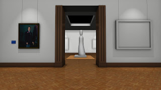
Added the Lintel, as well as a bump map to the floor (made from the texture file, using the "find edges" filter on the red chanel)

Alan showed me how to use point lights properly to add light to a space, so that sorted out the problem I was having with the ceiling of the back room

Adjusted the lighting to get the effect I wanted


Added the second painting (again, the info plaque is correct ^^;)

Put in the two paintings at the back

Added a little detail to the plinth


Following Phil's suggestion, trying out a version with red walls; I think it works better so I'm sticking with it

Added a plane to make the Matte Mask (green lambert with the diffuse turned up to about 5)

Made final version with the statue placeholder removed to make the matte painting easier


Monday, 17 January 2011

Environment Modelling part 1

Starting with the sketch model, I began by experimenting with camera position; particularly focal length

tried out the "counterzoom" technique to see what the image looked like with greater depth of field

Liked the counterzoom, so extended it a bit further

added first painting to see how it looks

Did an occlusion pass to see how the final image would look

Added label to painting (it actually does have the details, but you can't read it at 1080p resolution ^^;), as well as tweeking the lighting

Added Parquet floor texture (really taxed photoshop making it - lots of big layers ^^;)

The walls seemed a bit "dull", so I tried adding a slight bumpmap texture to give a little visual "noise"

 Latest image