 |
| Artist: Kumi Yamashita |

Tuesday, 28 December 2010
Shadow Art
Although it's a bit late, this did make me think that it might be an interesting bit of inspiration for the creepy environments, plus I think it's cool :D
there's more of his work here
Friday, 17 December 2010


Monday, 13 December 2010
Project Ideas
After a lot of thought, I think my favourite 3 ideas for the project are
1. The Classroom

2. The Museum

3. The Toy Shop

1. The Classroom

2. The Museum

3. The Toy Shop


New essay Idea
after some more thought, I've come up with a new essay idea
"an investigation into the impact of the uncanny on robot design"
this will let me talk about real robotics as well as film/television robots
"an investigation into the impact of the uncanny on robot design"
this will let me talk about real robotics as well as film/television robots
Fighter Jet Update 2
I think I'll call it the F/A-17 Shrike
since Jon Stuart asked to see some wireframes, here they are


Weapons are
Wingtip rails: AAM-8B Adder IR guided dogfight air-to-air missiles
Outer wing hardpoints: AGM-65A Maverick TV guided air-to-surface missiles
Inner wing hardpoints: 1000lb GPLD bombs
 |
| Added Weapons, Airbrake and more detailed cockpit |
since Jon Stuart asked to see some wireframes, here they are


Weapons are
Wingtip rails: AAM-8B Adder IR guided dogfight air-to-air missiles
Outer wing hardpoints: AGM-65A Maverick TV guided air-to-surface missiles
Inner wing hardpoints: 1000lb GPLD bombs
The Haunting (1963)
 |
| Fig. 1 |
This classic "haunted house" film (some argue it is the definitive haunted house film (Romance, 2008)) is an excellent example of how suggested horrors can be at least as frightning (if not more so) than any monster conjured up by the special effects department. The film opens with a creepy exterior shot of the main setting, Hill House (shot using infra red film to increase the contrast), while a suitably creepy narration sets the mood. There then follows a potted history of Hill House itself, focussing mainly upon the series of deaths linked to it (each death suggested rather than explicitly depicted).
The interior of Hill House, which forms the setting for most of the action, is a beautifully designed series of sets, full of gothic detailing that help the ominous atmosphere (Samuel, 2010). In particular, the house is full of old mirrors, their strangely distorted reflections of reality helping to convey a feeling of "otherness" to the audience. Several times, mirrors in unexpected places catch both the viewer and the cast by surprise, giving momentary impressions of mysterious strangers watching from the shadows.
.jpg) |
| Fig 2. |
A key feature of the film is the way that most of the shocks are derived from nothing more that a combination of sound effects and camera work, for example the loud noises that terrify the two female stars are achived by loud bangs coupled with sudden zooms towards the door of the room. This technique of unseen horrors continues throughout the film; for example the mysteriously closing doors are never seen to move, but rather shift silently from open to closed when the camera is looking elsewhere. Until the denoument of the film, the only part of the house that is actually seen to move is a rickety cast iron spiral staircase in the library/belltower, and this is ambiguous as it could simply be an old and dangerous staircase shifting when someone tries to climb it.
 |
| Fig. 3 |
 |
| Fig. 4 |
A final theme that runs through the film is the use of light and shadow to turn everyday objects into sinister shapes. This is at its strongest in the bedroom scene, when the tiles on the wall morph into a sinister face, staring into the camera as eerie screams echo around the house. However, there are also many lesser examples, for instance the carved faces that decorate many of the door frames "(seem to be)...hybrid of cherubs and gargoyles depending on the angle and lighting when you glance at them" (Samuel, 2010)
List of Illustrations
Figure 1. MGM (org) (1963) "The Haunting" Theatrical Poster [digital image] At: http://www.movieposterdb.com/poster/d2493581 (accessed on 07/12/10)
Figure 2. MGM (org) (1963) The Haunting [film still] At: http://filmnoirphotos.blogspot.com/2010/08/reflections-julie-harris.html (accessed on 07/12/10)
Figure 3. MGM (org) (1963) The Haunting [film still] At: http://staticmass.net/features/the-haunting-1963 (accessed on 13/12/10)
Figure 4 MGM (org) (1963) The Haunting [film still] At: http://staticmass.net/features/the-haunting-1963 (accessed on 13/12/10)
Bibliography
Romance, V (2008) The Haunting (1963) In: Fatally Yours [Online] At: http://www.fatally-yours.com/horror-reviews/the-haunting-1963 (accessed on 13/12/10)
Samuel, P (2010) The Haunting (1963) & The Gothic In: Static Mass Emporium [Online] At: http://staticmass.net/features/the-haunting-1963 (accessed on 13/12/10)
Taylor, R (2004) The Haunting In: Not coming to a theatre near you [Online] At: http://www.notcoming.com/reviews/haunting (accessed on 13/12/10)
Sunday, 12 December 2010
Thumbnails 4
trying to come up with some more ideas, I remembered that dead things are generally held to be creepy (right? ^^;), and that reminded me of the biology classroom at secondary school, with its collection of pickled animals in jars. Therefore, I came up with this
 along with an alternative version
 Another idea I had was to use a church, on the basis that they're a place of safety, but also offer plenty of opportunity with creepy statues and paintings and things
 I also tried to combine the hollywood suburbia with the ambiguous morality pictures of the 19th century
 with that in mind, I tried to create a skullish house
 however, I thought the angle made it a bit unclear, so I tried a more obvious angle
 however, I'm not sure if this one was a bit too obvious to ruin the effect ^^;
The other idea I wanted to explore using was Masks, which I like because 1: they're cool & 2: they give plenty of opportunity to play around with designs. After a bit of thought, I tried to do a scene in a museum as it seemed to give plenty of opportunity for creepy details (particularly as I planned to do it at night, when most museums are closed and therefore have an air of mystery)


The other idea I wanted to explore using was Masks, which I like because 1: they're cool & 2: they give plenty of opportunity to play around with designs. After a bit of thought, I tried to do a scene in a museum as it seemed to give plenty of opportunity for creepy details (particularly as I planned to do it at night, when most museums are closed and therefore have an air of mystery)
Wednesday, 8 December 2010
Thumbnails 3
this time, there's even a train of thought linking them together XD
The idea of this one was an image with a strange viewpoint - in this case one of someone lying on their back with their head tilted to one side (such as someone who's slipped and fallen/been coshed). Unfortunately, the image itself doesn't read very well, so I obeyed film-making convention by keeping "up" up and rotating the image
 This version of the image is a lot simpler, and I like the effect of the portraits on the wall looking down at the viewer (particularly if they're staring out of the gloom).
 Carrying on the theme of staring portraits, I did this (quite gothic) corridor, complete with gloomy portraits and candelabra.
The notion of the viewer being stared at led to the idea of a shop window full of dolls all staring at the camera.
 |


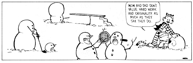
Bill Watterson Snowmen
Talking to Phil after watching Repulsion, I was surprised he'd never seen any of Bill Watterson's Calvin and Hobbes snowmen (bear with me, I think they might be related to the current project)
So, to at least start to remedy the situation, here are a select few examples
Of course, these are just a few examples, but I think they suggest an interesting line of approach to the project...
So, to at least start to remedy the situation, here are a select few examples
 |
| copyright Bill Watterson |
 |
| copyright Bill Watterson |
 |
| copyright Bill Watterson |
Of course, these are just a few examples, but I think they suggest an interesting line of approach to the project...

Polar Express Musings
After what Phil said about Polar Express being full of (unintentional) zombies, I got it out the library to watch (along with the art book). Having watched it, I'm not sure I agree with him on the zombie issue ^^; Some of the facial models look unnatural (from the art book, I think the problem was caused by the 3D modellers sticking too closely to the character designer's drawings and not tweeking where necessary). Intellectually, I can see why people might find it uncanny and disturbing, but I'm afraid for me it's just another entry in the list of things that don't scare me ^^; I did quite like the carriage of abandoned toys though; the dirty toys seemed to be an interesting basis for an image.
Incidentally, I think it was probably a mistake of the director to go for the "most sinister Santa's elves in a film" award...
 |
| Amazingly, he's one of the more normal looking ones... |


Wednesday, 1 December 2010
Thumbnails 1
some quick thumbnails based upon my early thoughts on the project brief
 The first 3 are station based (top right is based on earls court tube station ^^;) while the lighthouse just sort of grew out of the port (although thinking about it now it is also related to a genuine mystery/ghost story)

Essay Idea
I was just watching "the Cat Returns", when I was struck by a question that I think could be the basis for my Environment essay:
Why don't cat-girls live in the uncanny valley?
Whilst it's not directly about any specific film, artefact, artwork etc. there are plenty of examples of cat-girls in all of those categories, and I think it would be interesting to examine the uncanny as it were from a contradictory position ^^;
Basically, would this be okay as the subject of my essay?
Environment Ideas
after a quick read through of the brief and associated stuff, I was struck by the possibilites of "interchanges", places where lots of people cross paths. I know modelling people is basically impossible in 5 weeks, but since the places I'm thinking of are usually full of people, having them empty is going to automatically add a bit of distance from the usual.
In particular, I'm drawn to the possibilities offered by stations and ports (sea and air), as they are often large, impersonal spaces (and offer plenty of scope for shadowy figures glimpsed in distant doorways, that sort of thing
XD). They also give an opportunity to try out various architectural styles and other ways of mixing things up a bit
Any thoughts?
Tuesday, 30 November 2010
Fighter Jet Update

Added Hardpoints and IRST dome
Should probably come up with a better name than "fighter jet" though
Project idea (very rough)
Thinking about what Phil said about ambiguity, I was reminded of the "Fortress of Ultimate Evil" in Terry Gilliam's "Time Bandits", and how it is constructed to look like its made from giant lego bricks
I wondered if I could use a similar technique to make an image that's ambiguous in scale...
Lifedrawing 23/11/2010

 |
| Trying only using hatching in only one direction |
 |
| Trying combining one-directional hatching with dark background to define form |


Monday, 29 November 2010
Maya Space Project final renders


Followed Alan's instructions, apart from adding a camber on the road and door handles (since a street of buildings without doorhandles looked weird)
Also tried out a basic bit of texturing

and for a bit of a laugh :)
 |
| the CG artist's recurring nightmare lol |
Subscribe to:
Posts (Atom)